Color Design in Interior Design: Creating Emotion and Functionality
Color design is crucial in interior design, as it emotionally influences how we perceive space and supports functionality. Colors impact our mood and shape the atmosphere of a room—from calming blues and greens to energetic reds and yellows. Current trends highlight earthy tones and bold accent colors, which, when combined harmoniously, can create inviting and inspiring spaces.
Practical color selection tips help you find the perfect palette to achieve your desired ambiance. Ever wondered why one room feels off while another captivates you instantly? The answer often lies in color. This intriguing interplay of psychology and aesthetics brings spaces to life. Discover in this article how color influences both emotion and functionality—and get ready for valuable insights to help you design your next project with confidence and clarity.
The Psychology of Color in Interior Design
Color psychology plays a vital role in interior design, shaping how we perceive and experience spaces. Colors go beyond decoration—they carry meanings and trigger emotions that affect our mood and behavior. Soft blues and greens often evoke calm and relaxation, while bold reds suggest energy and passion. Yellows can create a cheerful and optimistic atmosphere. These emotional responses are grounded in decades of color psychology research, making thoughtful color selection essential for creating harmonious and effective interior environments.
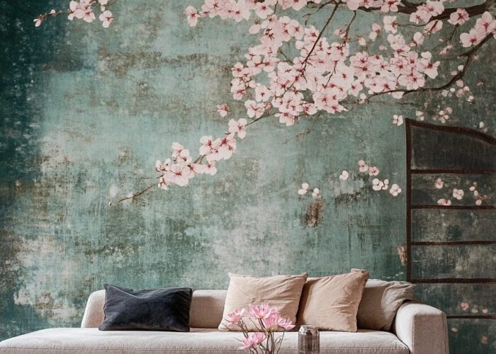
The Emotional Impact of Color
Colors have the power to influence our emotions and shape the atmosphere of a space. Studies show that warm hues like red, orange, and yellow are often linked to energy and stimulation, while cool tones such as blue and green tend to evoke calmness and relaxation. For spaces meant to spark creativity, vibrant colors may be ideal. In contrast, soft, muted tones are better suited for bedrooms or areas meant for rest. Understanding color psychology is key to creating mood-driven, emotionally supportive interiors.
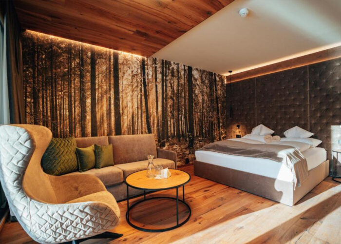
Color Psychology in Architecture
Architects use color psychology to design spaces that align with the emotional and functional needs of their users. Whether in public buildings or residential spaces, carefully selected color schemes can enhance a room’s usability while also promoting well-being. For instance, in schools, a balanced mix of calming and stimulating colors is often used to support both concentration and creativity. A strategic use of color helps shape mood, behavior, and spatial experience—making it an essential element in thoughtful
architectural design.
Choosing the Right Colors: More Than Just Taste
Selecting the right colors is not merely a matter of personal preference—it requires a deep understanding of color psychology and awareness of current interior design trends. When these factors are thoughtfully considered, you can create spaces that are not only visually appealing but also functional and inviting. Well-planned color schemes can significantly enhance the overall impact of a room, making color design a key element in successful interior architecture.
Color Design as the Key to Successful
Interior Design
Effective color design is essential to successful interior design and can dramatically transform the impression a space makes. When planning your interiors, it’s important to view color not just as a decorative element, but as a powerful tool that shapes both atmosphere and functionality. Color choices influence visual perception as well as the emotional experience of those using the space. Let’s explore how the thoughtful use of color can help you create an interior that truly captivates and inspires.
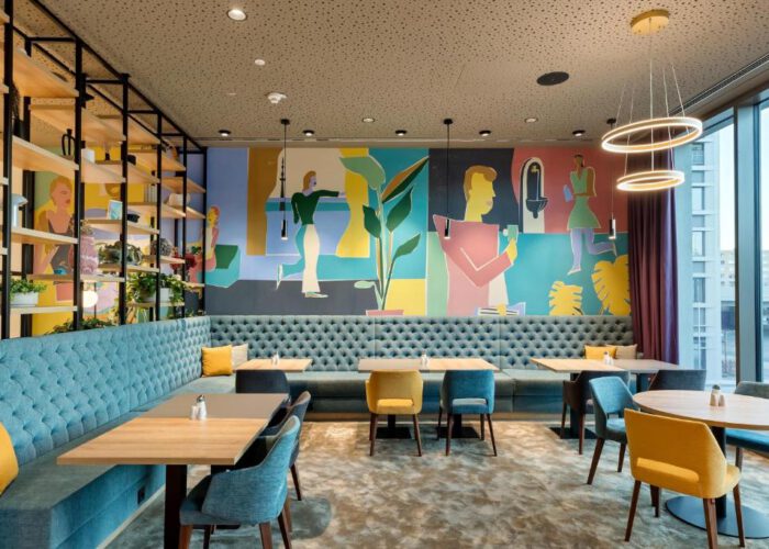
The Importance of Color Psychology in Interior Design
Colors are more than just visual stimuli—they are emotional messengers. When designing a space, you can create a specific mood through the deliberate choice of colors. Remember, a room in soft blues or greens can promote calm and relaxation, while bold reds radiate energy and passion. These psychological effects are not random, but rooted in deep cultural and emotional associations we have with different hues. To make the most of color in interior design, consider which emotions you want to evoke and how those colors will interact within your space.
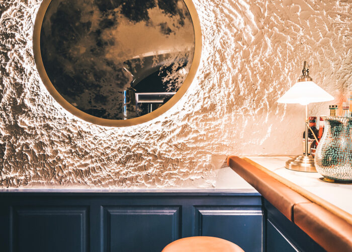
The Role of Accent Colors
Accent colors are like the cherry on top of your favorite dessert – they bring everything to life! When you start with a neutral color palette as your base, bold accent colors can be used to create intentional highlights. It’s important that these accent tones complement the overall design concept and don’t overwhelm the space. A vibrant red or a bright yellow can be introduced through cushions, artwork, or even furniture to add personality to the room. Just make sure the accent colors not only look good, but also contribute to the mood you want to create.
Practical Tips for Implementation
When planning your color scheme in interior design, there are several practical tips that can help you:
-
Test colors on site: Before making a final decision, always test the color in the actual space. Lighting conditions and surrounding furniture can significantly affect how a color appears.
-
Use color swatches: Color swatches are a great tool to compare different shades and see how they work together.
-
Consider room flow: Make sure the colors in adjacent rooms harmonize with each other to create a smooth and cohesive transition.
-
Be bold: Don’t be afraid to experiment with color! Some of the most inspiring ideas come from bold choices.
With these tips, you’ll be well-prepared for your next interior design color project.
However, effective color design should not only be visually appealing—it must also take into account the functional aspects of the interior.
Trends in Color Design
Current trends in color design highlight the importance of choosing the right colors for different applications in interior design. We are currently seeing a strong movement toward natural color schemes and earthy tones that evoke a connection to nature. These hues not only create a harmonious atmosphere but also promote a sense of comfort and stability.
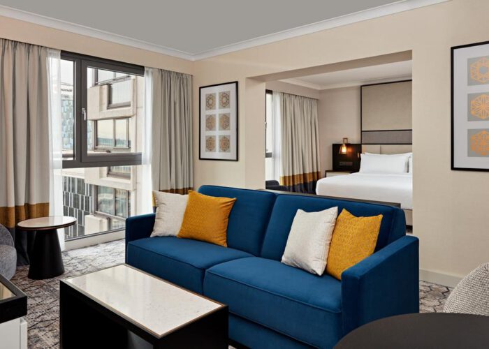
At the same time, bold color combinations are gaining popularity—think vibrant accent colors paired with soft base tones. This mix brings energy and liveliness to a space while maintaining a sense of balance and cohesion.
Color Concepts for Different Rooms
The right choice of colors largely depends on the function of the room. In a living area, you might want to create a warm and cozy atmosphere—warm tones like soft yellows or earthy browns work particularly well here. In a home office, on the other hand, a cool blue or an energetic orange could stimulate creativity and boost productivity.
So, when planning each room, consider its purpose and the atmosphere you want to achieve. A well-thought-out color concept takes into account both the emotional and functional aspects of the interior.
Color Harmony and Contrasts
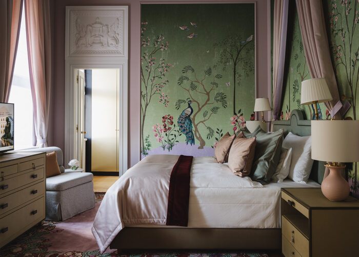
Color harmony and deliberate contrasts are essential for creating visual interest and balance within a space. When planning how to design your rooms, it’s important to view colors not just as decorative elements but as powerful tools that shape the ambiance and functionality of a room. In interior design color schemes, the goal is to find a balance between harmony and tension—both of which can contribute to the atmosphere of a space in different ways.
Monochromatic vs. Complementary Color Schemes
Monochromatic color schemes offer a calm and cohesive aesthetic, while complementary colors can create vibrant tension and energy. With a monochromatic approach, you choose various shades and tones of a single color. This results in a harmonious and relaxing atmosphere, making it ideal for retreat spaces like bedrooms or reading nooks. Imagine combining soft blues with a deeper navy — it feels both elegant and soothing at the same time.
The Role of Neutral Tones
Neutral colors play an important role in highlighting other colors and creating a harmonious background. They are like the unsung heroes of color design: they allow vibrant accent colors to shine while giving the space structure and depth. A chic white or a soft gray can serve as a base upon which you can build your color concepts.
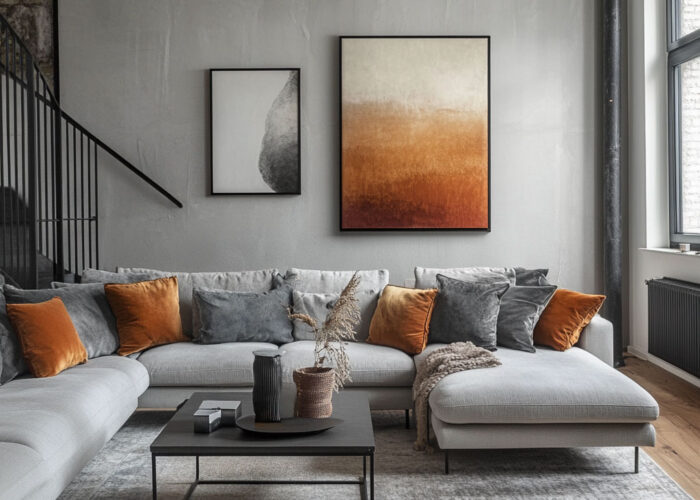
Neutral tones are also extremely versatile and easy to combine with other colors. So, if you have a room with colorful furniture or artworks, neutral walls can ensure these elements don’t get overshadowed. They provide the perfect backdrop for playing with colors without causing visual overload. Earthy tones like beige or taupe are especially popular, as they create a warm and inviting atmosphere.
Another advantage of neutral colors is their ability to make a space appear larger. Light neutral tones reflect light better and can help visually open up small rooms. So, if you’re designing a small hallway or a compact living room, light neutrals are an excellent choice.
Practical Tips for Implementing Color Harmony and Contrast
When working with color harmony and contrast, here are some practical tips that can help you:
- Use the Color Wheel: The color wheel is a fantastic tool for finding harmonious combinations. Look at which colors are opposite or next to each other—it helps you create exciting contrasts or smooth transitions.
- Test Samples: If you’re unsure how different colors will interact, try out samples like fabric swatches or paint tests on the wall. This way, you can immediately see how the colors work together in the space.
- Consider Lighting Conditions: Lighting in a room significantly affects how colors are perceived. A room with plenty of natural light can handle bolder colors better than a darker space.
- Use Accents Purposefully: Apply accent colors strategically—through furniture, cushions, or artwork. These small pops of color can enliven the overall look and add personality to the room.
By keeping these tips in mind and finding the right balance between harmony and contrast, you can create spaces that are both aesthetically pleasing and functional. Remember, good color design should not only look beautiful but also consider the practical aspects of the interior.
Color Design in the Context of Functionality
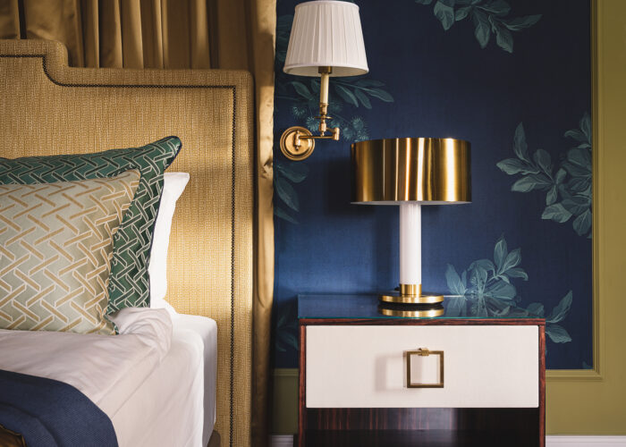
Color design should not only be aesthetically pleasing but also take into account the functional aspects of the interior. When considering how colors work in your spaces, it’s important to recognize that the choice of colors doesn’t just have a visual impact—it can also greatly influence how a room is used and how it feels. Thoughtful color design in interior design can not only elevate the mood but also maximize the functionality of a space. Let’s dive deeper into the various factors to consider when selecting colors for your projects.
Color and Spatial Perception
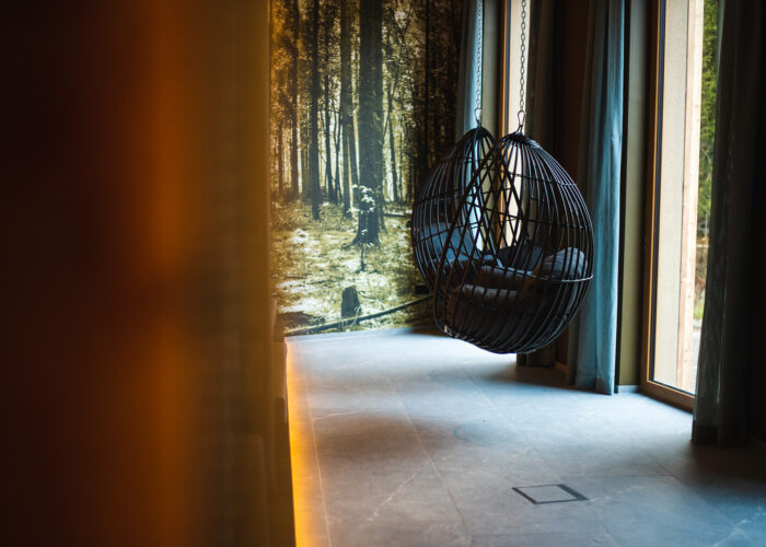
The choice of colors can significantly influence how we perceive the size and depth of a space. If you have a small room, using light colors such as soft white or pale yellow can create an illusion of spaciousness. These colors reflect light, making the room appear more open and airy. Imagine you have a narrow hallway: painting it in a cool blue might actually make it feel even tighter. Instead, a warm beige or light gray could give the space a greater sense of openness while also creating a welcoming atmosphere.
Dark colors, on the other hand, can be used to make a space feel cozier and more intimate. A deep red or a rich green can create a warm and inviting environment in a large room. These tones draw the eye and can help define and structure spacious areas. However, when using dark colors, it’s important to ensure there is sufficient lighting to maintain a comfortable atmosphere.
Practical Tips for Color Selection
Practical tips for color selection help architects and interior designers make the best decisions for their projects. First and foremost, it is advisable to keep the function of the room in mind. A workspace benefits from energetic colors like vibrant yellow or orange, while bedrooms should be designed with calming tones such as soft blues or greens. These considerations are crucial to ensure that the space is both functional and emotionally appealing.
Another tip is to use color swatch cards. These handy tools are perfect for comparing different shades and discovering how they work together. Experimenting with various combinations can help you find the perfect color palette for your project. Additionally, you should keep in mind that the lighting conditions in a room can significantly affect the perception of colors. A space with plenty of natural light can handle stronger colors better than a darker room.
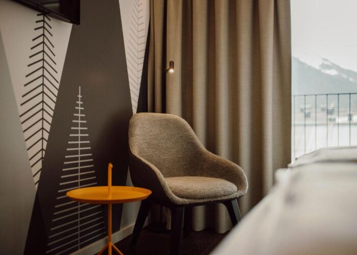
Another important aspect is the combination of colors with materials and textures. Wood or metal surfaces can either highlight or soften certain shades. For example, a warm wooden shelf paired with a cool blue wall can create an interesting contrast and make the space feel lively. Therefore, it is advisable to consider materials alongside color choices in order to create a harmonious overall look.
Additionally, it’s helpful to use accent colors strategically. These small pops of color can give a room personality while also creating visual interest. Remember, less is sometimes more—a few well-placed accent pieces often have a greater impact than an overwhelming flood of color.
Taking these practical tips into account will help you design spaces that are both functional and aesthetically pleasing. After all, the significance of colors in marketing and advertising also plays a crucial role, as they can influence customers’ purchasing behavior.
The Importance of Colors in Marketing and Advertising
Colors also play a crucial role in marketing, as they can influence customers’ purchasing behavior. If you’ve ever been in a store and felt drawn to products because of their colors, you know exactly what I mean. Colors are not just aesthetic elements; they are strategic tools that can shape brand identity and foster customer loyalty. The right use of color in a store’s interior design can make the difference between an impulsive purchase and leaving the store without spending a single cent.
Color Psychology in Branding
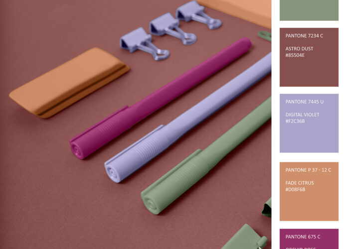
The choice of brand colors can strongly shape how a company is perceived and help build trust. Have you ever wondered why many fast-food chains use red and yellow? These colors are energetic and stimulate appetite—perfect for quick meals! Blue, on the other hand, is often used by banks and financial service providers because it conveys trust and security. So, when considering a new color concept for your business, think about which emotions you want to evoke and the message you want to send.
A great example is the use of green tones in the packaging of organic products. These colors suggest naturalness and freshness, which is especially appealing to environmentally conscious consumers. By choosing the right color, you can not only draw attention to your product but also build an emotional connection with your customers.
Colors in Advertising Materials
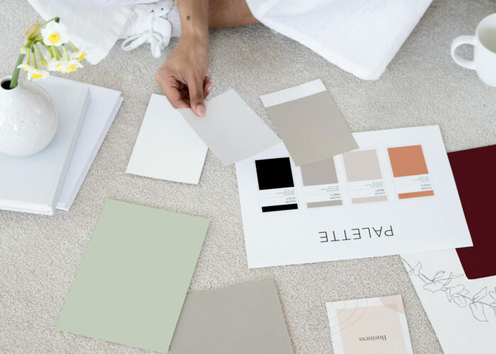
The right colors in advertising materials help communicate messages more clearly. Imagine flipping through a catalog full of products—the colors need to be harmonious while also drawing attention to the key elements. Well-designed advertising materials use colors strategically to guide the reader through the information and encourage them to
take action.
It’s important that the color scheme fits the specific medium. Online advertising can handle bolder, more vibrant colors, whereas printed materials often benefit from softer tones. This is because digital screens display colors more intensely than paper does. Make sure your color choices align with both the brand and the target audience.
Another example is the use of accent colors in call-to-action buttons on websites. These small pops of color can be crucial in determining whether a user clicks or not. When the button is in a contrasting color to the background, it stands out and draws immediate attention.
Practical Tips for Color Design in Marketing
When working with colors in marketing, here are some practical tips that can help you:
1. Target Audience Analysis: Think carefully about who your target audience is and which colors might appeal to them. Younger people often respond differently to colors than older generations.
2. Consistency: Keep your color palette consistent across all marketing channels. This creates recognition and strengthens brand identity.
3. Emotional Appeal: Use colors deliberately to evoke emotions. Consider what mood you want to create—whether it’s joy, security, or a sense of adventure.
4. Testing: Don’t hesitate to try different color combinations and gather feedback from your target audience. Sometimes a small change can have a big impact.
By keeping these points in mind, you can ensure that your color design in interior design not only looks appealing but also communicates effectively and positively influences your customers’ behavior.
Another example is the use of accent colors in call-to-action buttons on websites. These small pops of color can be crucial in determining whether a user clicks or not. When the button is designed in a contrasting color to the background, it stands out and draws attention effectively.
Conclusion
Colors are not just simple visual elements; they are the true heroes with the potential to transform spaces into vibrant worlds of experience. The influence of colors on interior design is extensive, ranging from affecting our emotions to shaping the functionality and atmosphere of a room. When thinking about how to design your environment, it is crucial to understand the psychology of colors. Colors have the ability to influence our mood and evoke certain emotions — whether it’s the calming effect of soft blues and greens or the energizing power of bold reds.
Architects and interior designers use these insights to create atmospheric spaces that meet users’ needs while also considering current trends in color design. The right color scheme is the key to successful interior design and can significantly change the overall impression of a room. Color harmony and deliberate contrasts play an essential role in creating visual interest and balance. Whether you choose monochromatic or complementary color schemes, the interplay of colors can greatly influence a room’s ambiance.
Additionally, you should not forget that the choice of colors must also consider practical aspects: light colors can make a space appear larger, while darker tones create a cozy atmosphere. And when we talk about colors, we must not overlook their importance in marketing and advertising. The right color choice can not only influence buying behavior but also strengthen trust in a brand.
If you want to learn more about color design and how to apply these concepts to your projects, check out our detailed article on Color Design in Interior Design. Ultimately, the art of color design is an exciting interplay between emotions, functionality, and aesthetics — so grab your color palette and let your creativity run free!
